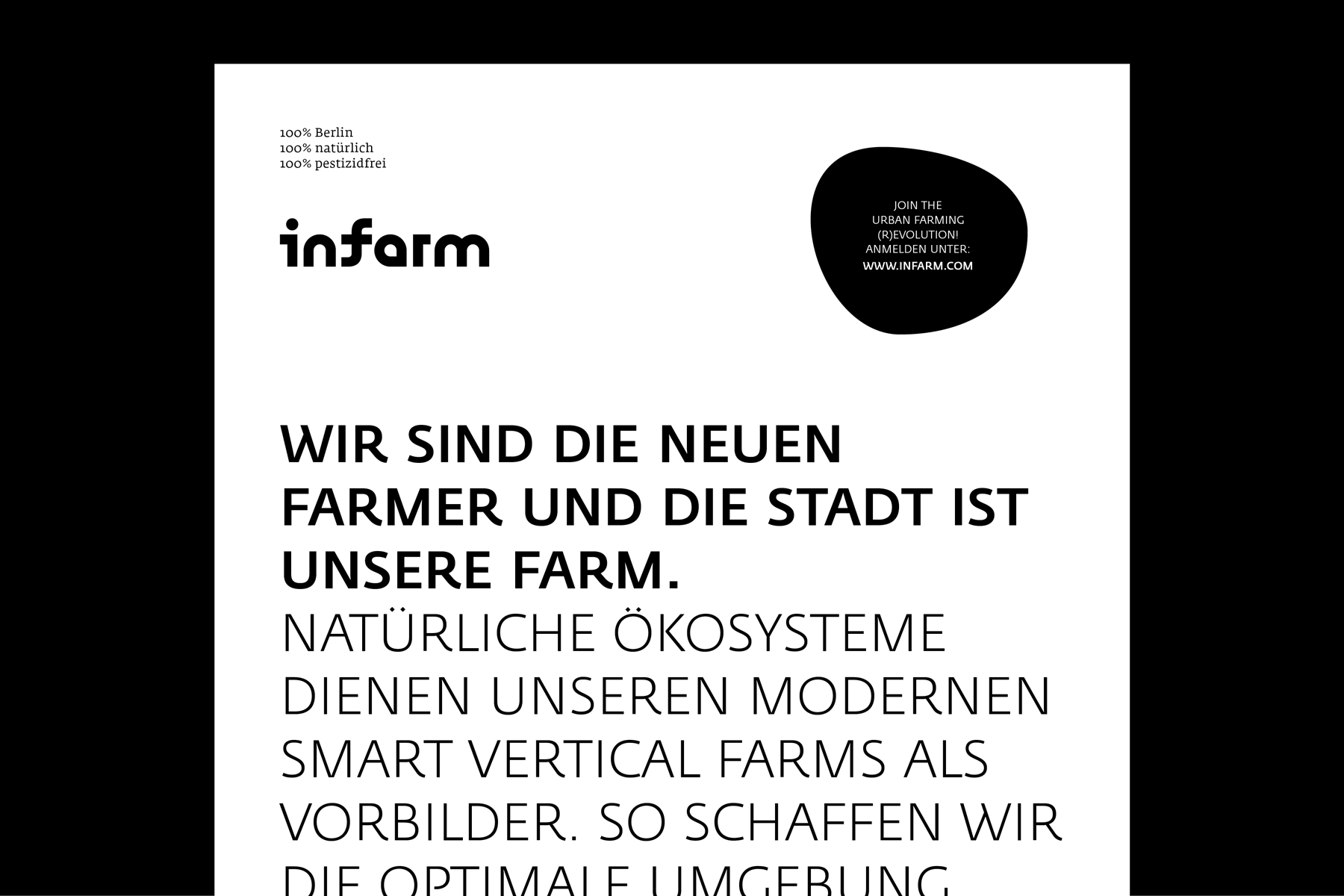
Infarm
Indoor Urban Farming
Visual Identity and ongoing graphic, 2016-21
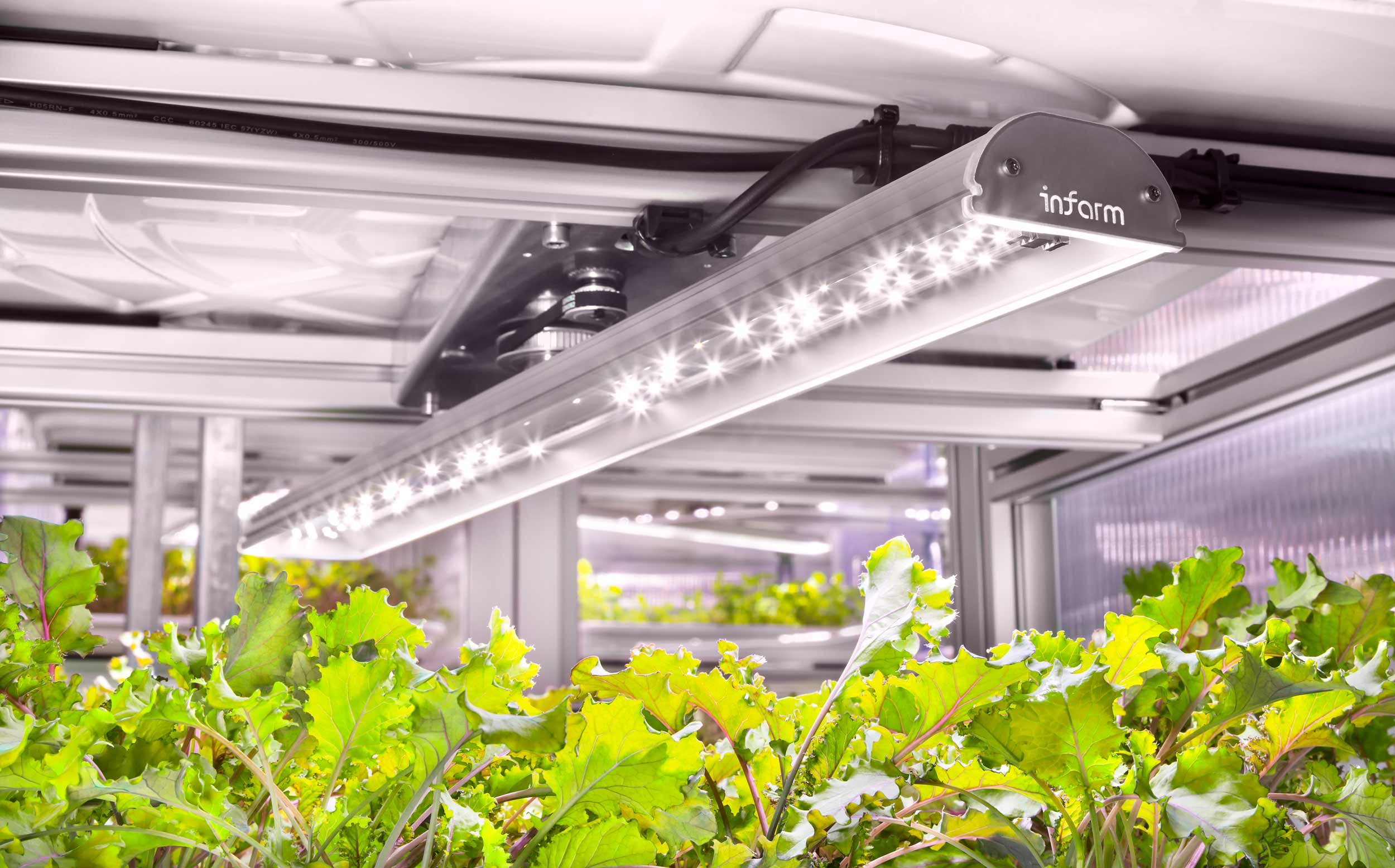
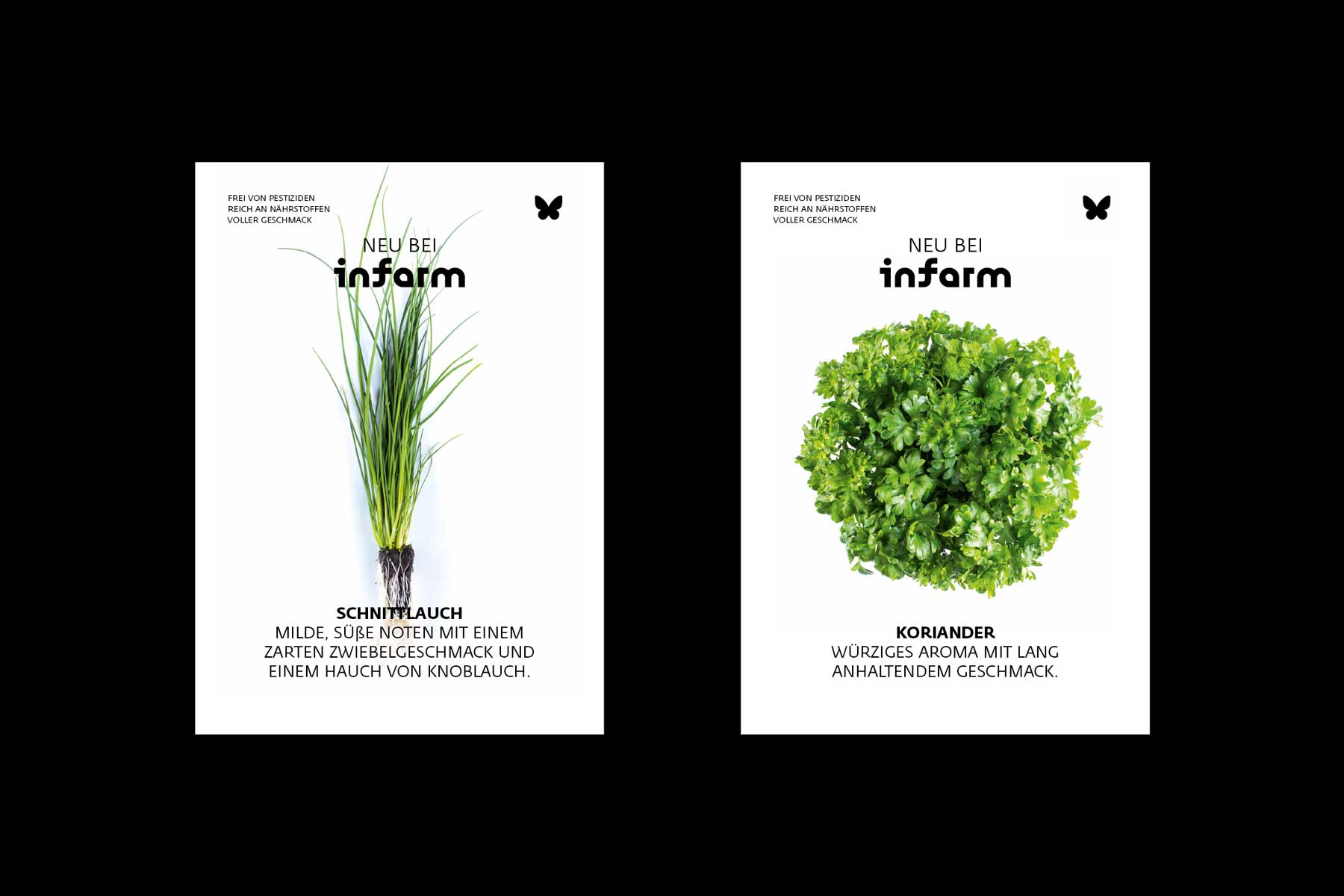
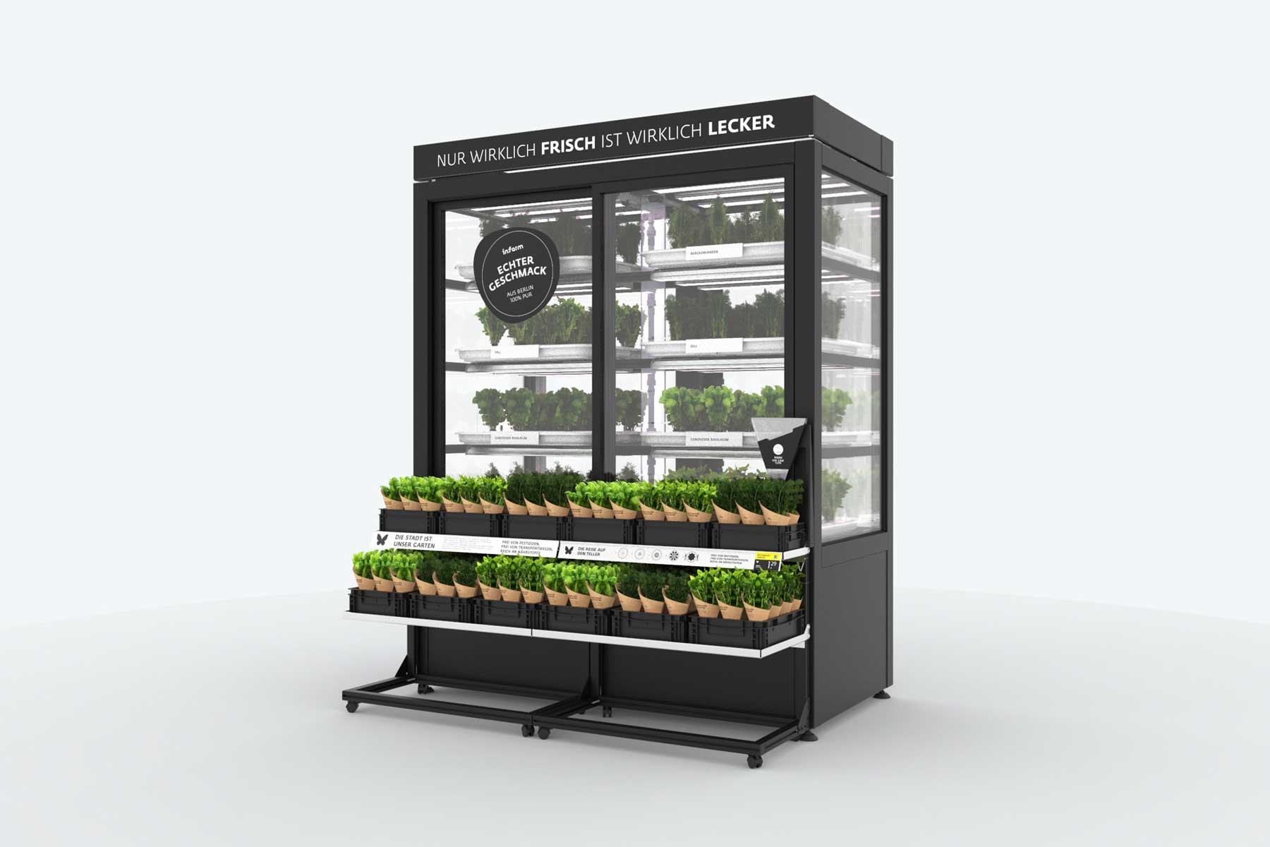
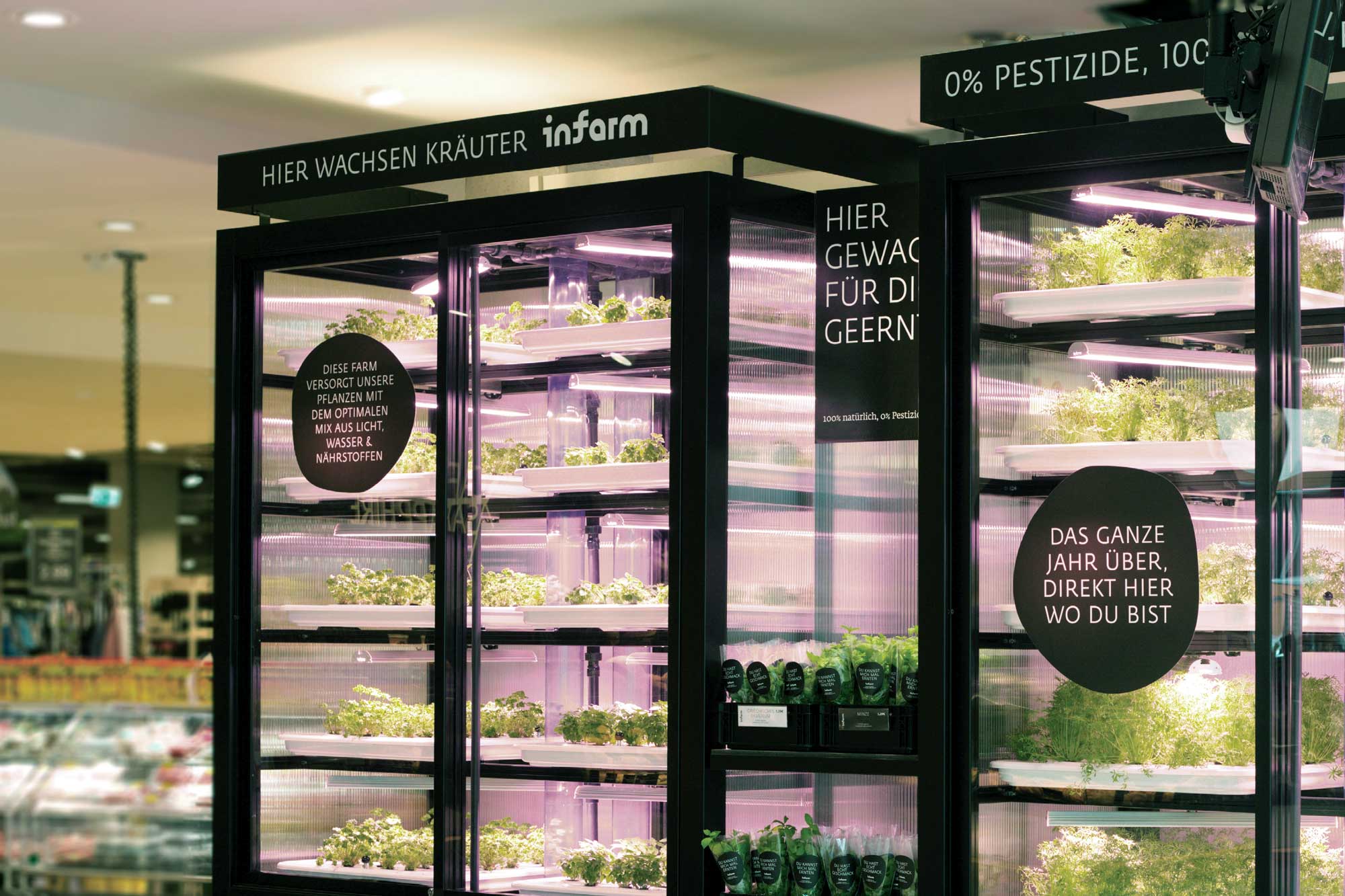
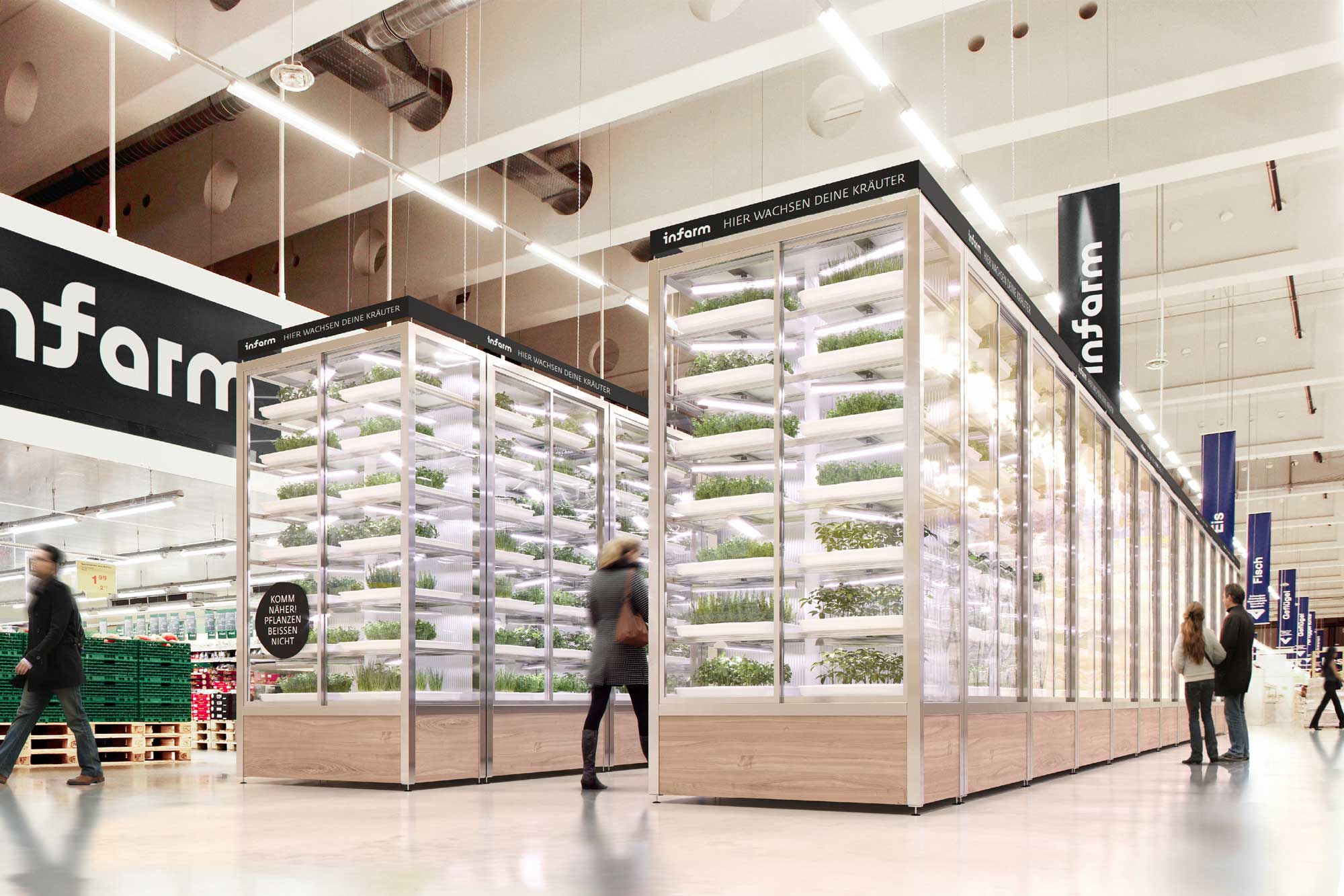
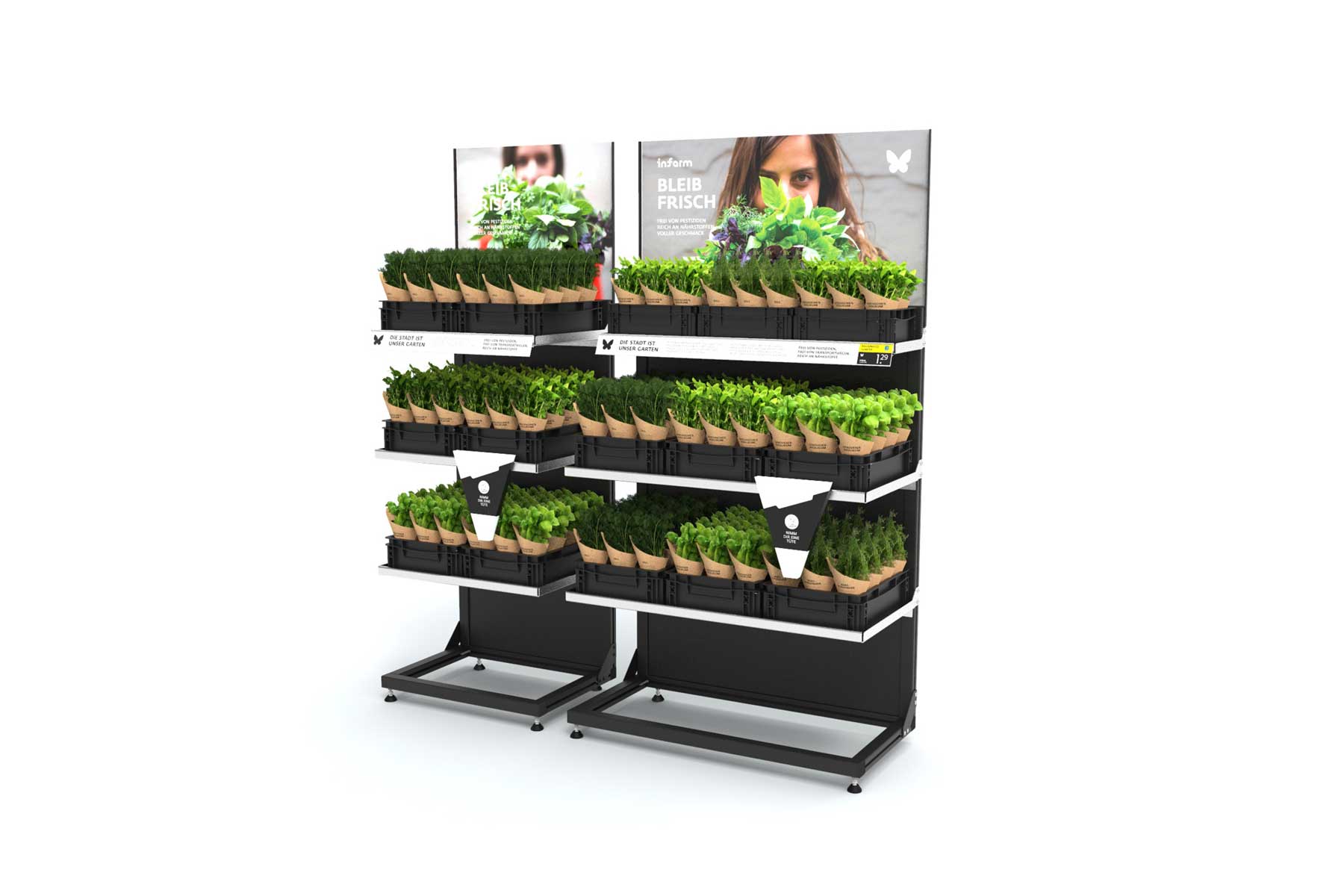
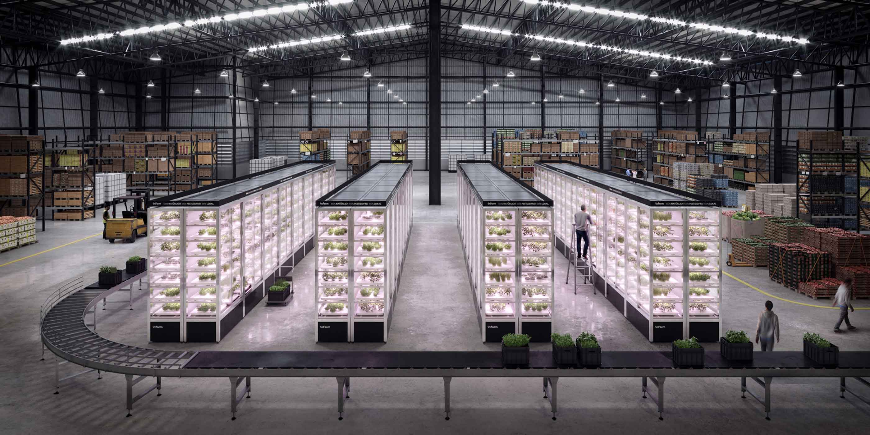
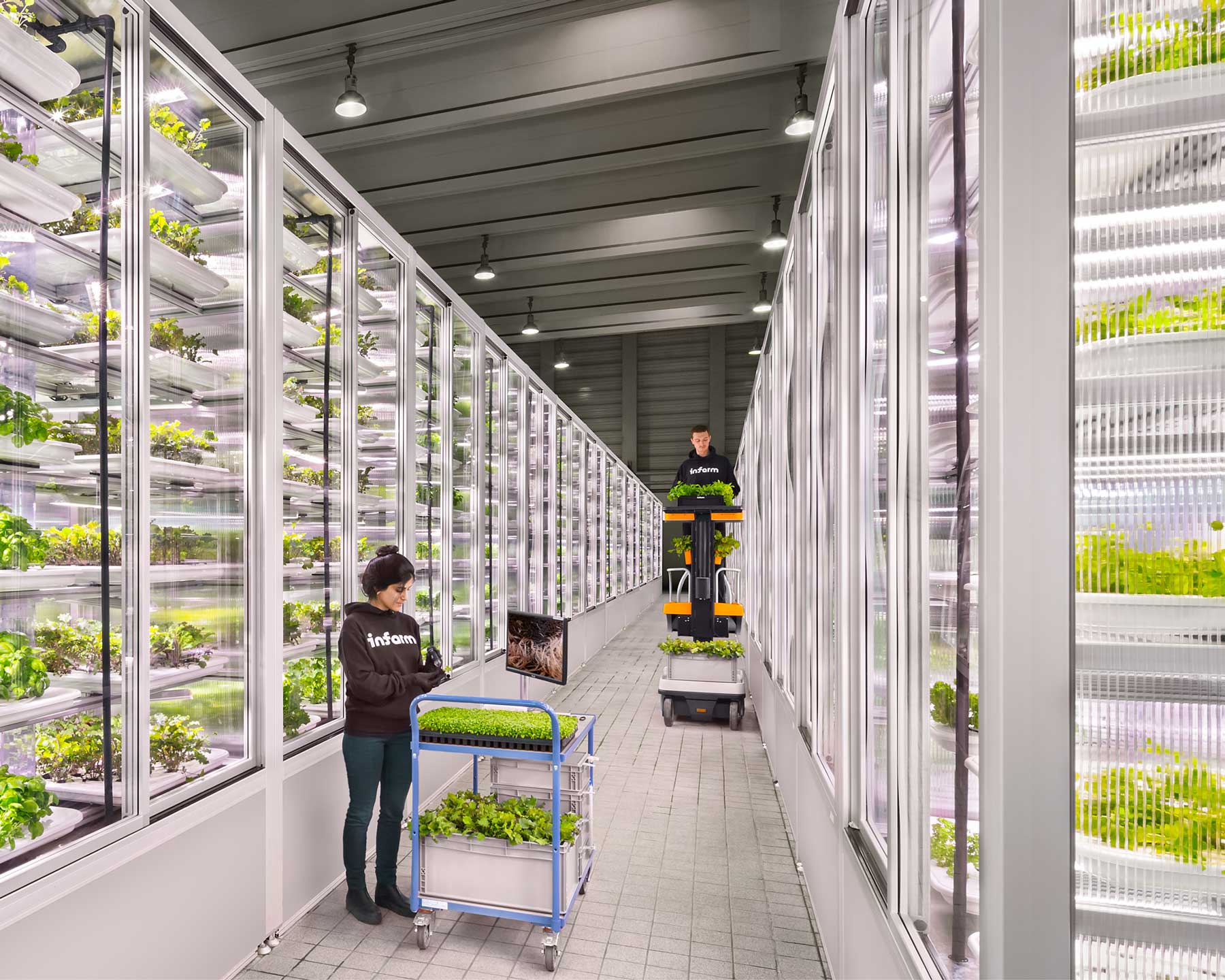
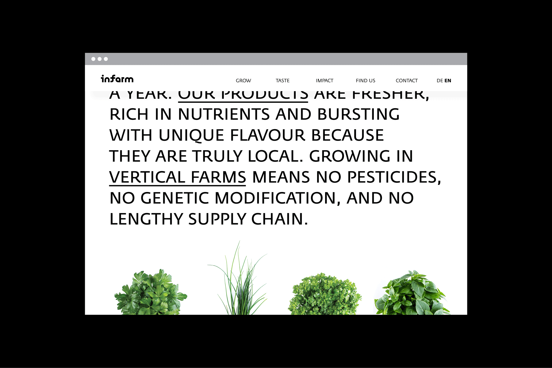
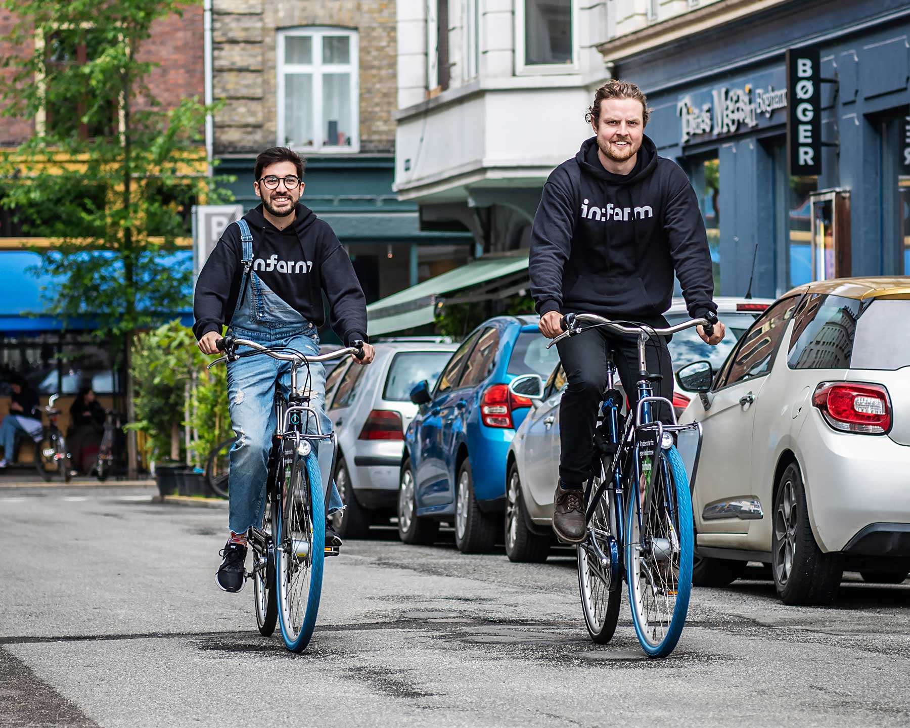
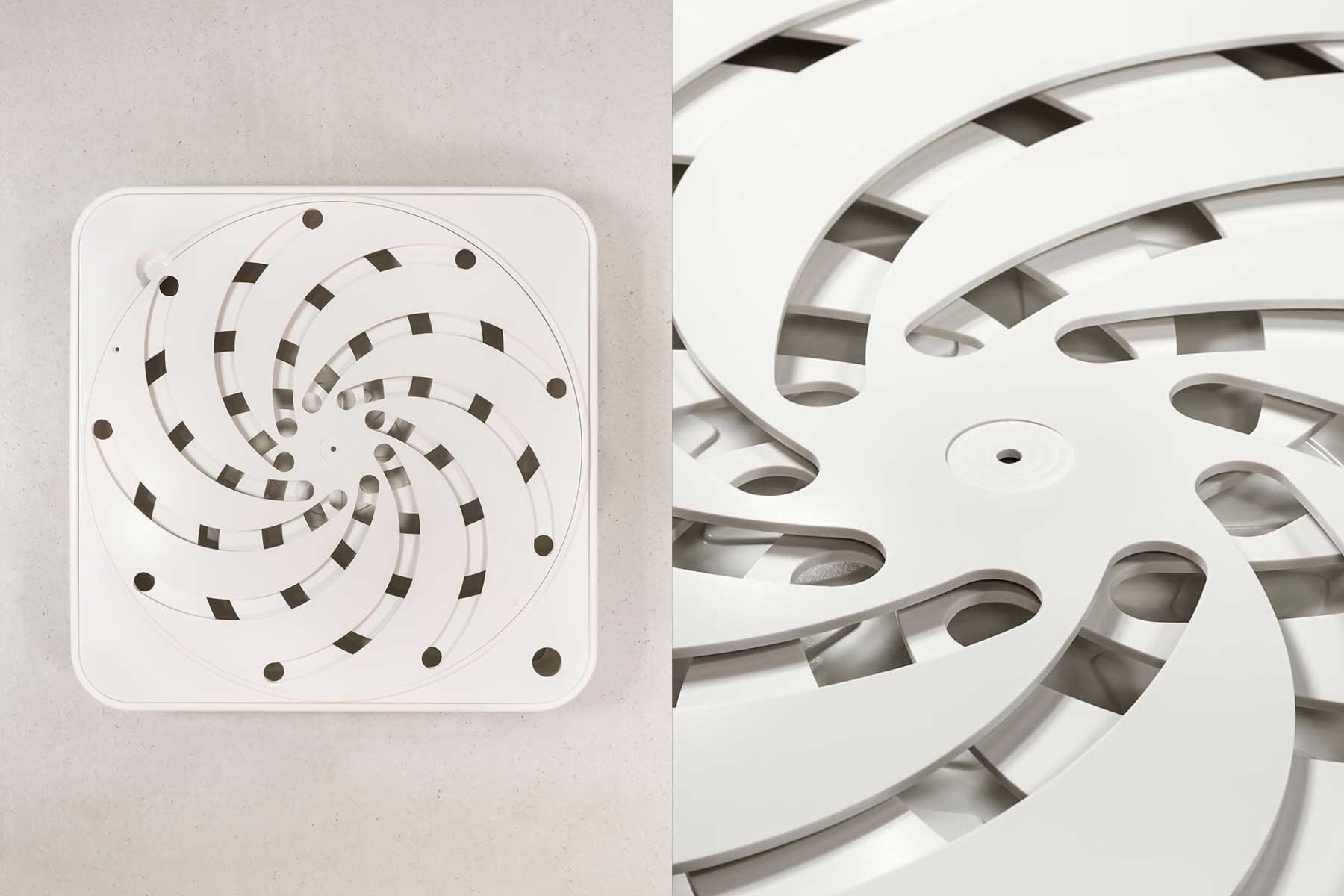
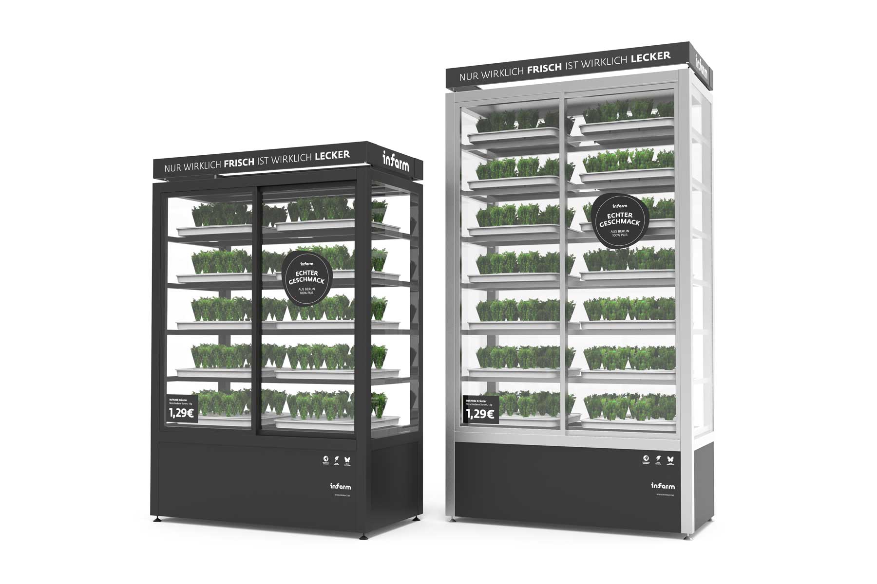
Infarm is a dedicated team of plant scientists, farming innovators, industrial designers, IT specialists, engineers, architects, chefs, marketing, and business experts. The company builds smart, modular farms suitable for any space and client demand. Infarm’s smart vertical farms mimic dynamic natural ecosystems to provide plants with the perfect environment to flourish. Varieties from around the world, available in one's own neighborhood.
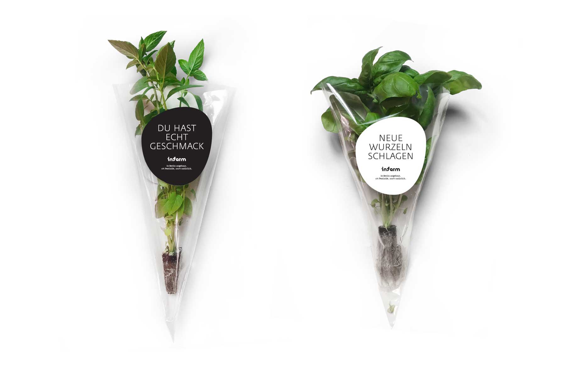
Infarm’s visual identity follows a merge of contradictory features: a clean high-techy, premium, urban look, with a natural, organic, regional approach. A clear and bold approach was defined. It is bold in its execution and attention to detail, but it is not loud – it is refined. It is geometric in its type and layout choices but it embeds soft organic graphic elements and icons.
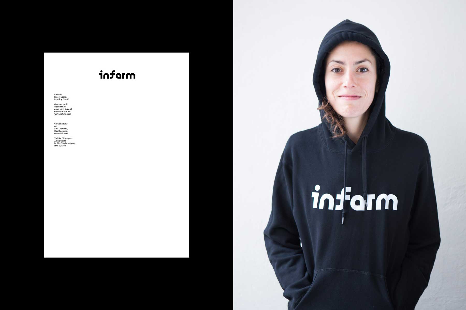


Infarm’s logo consists of geometric playful shapes. It has an inner contrast between a clean shape and a sense of flow and organic look derived from the softness of the letters “A” and “F”. Two logo variants were designed: a standard and slim stencil-version.
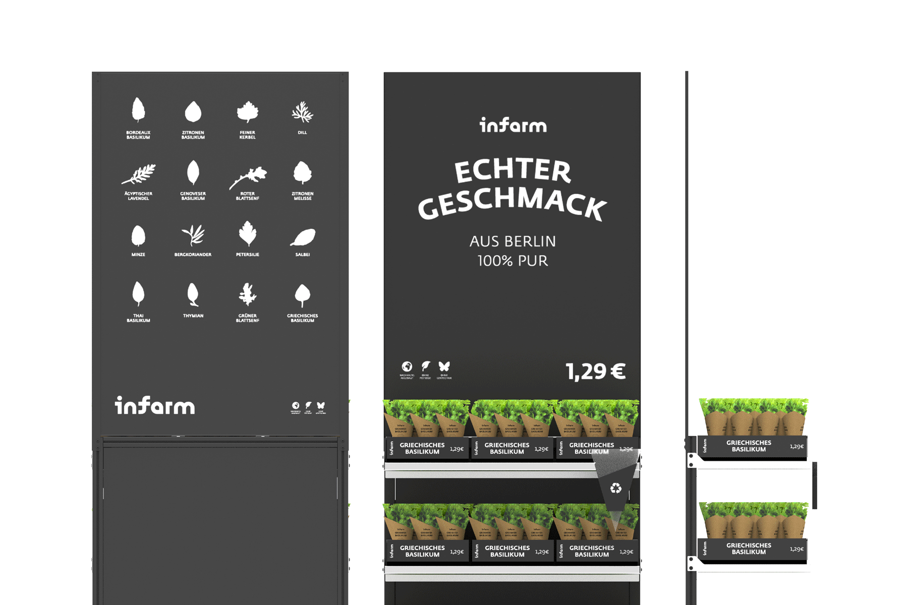
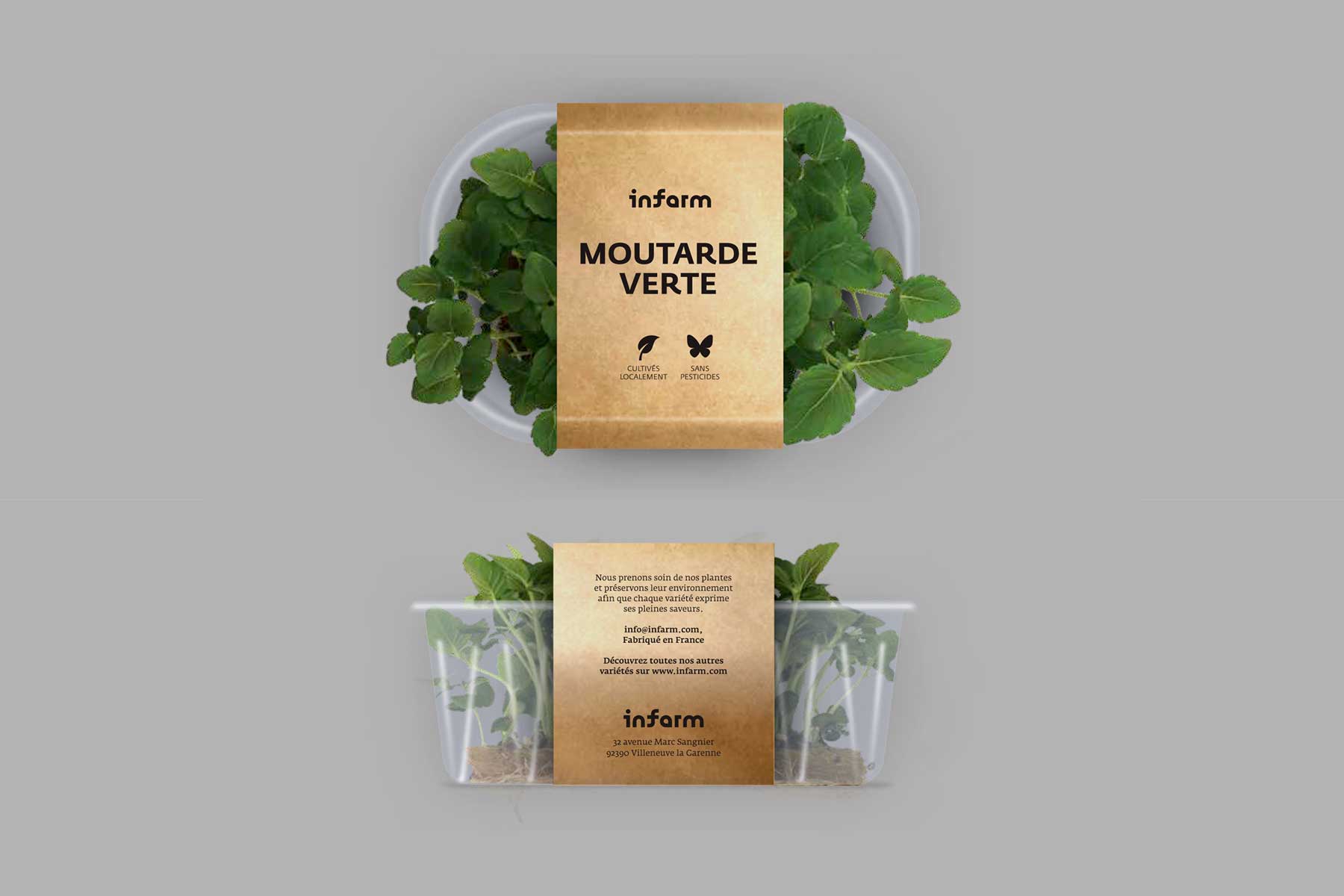
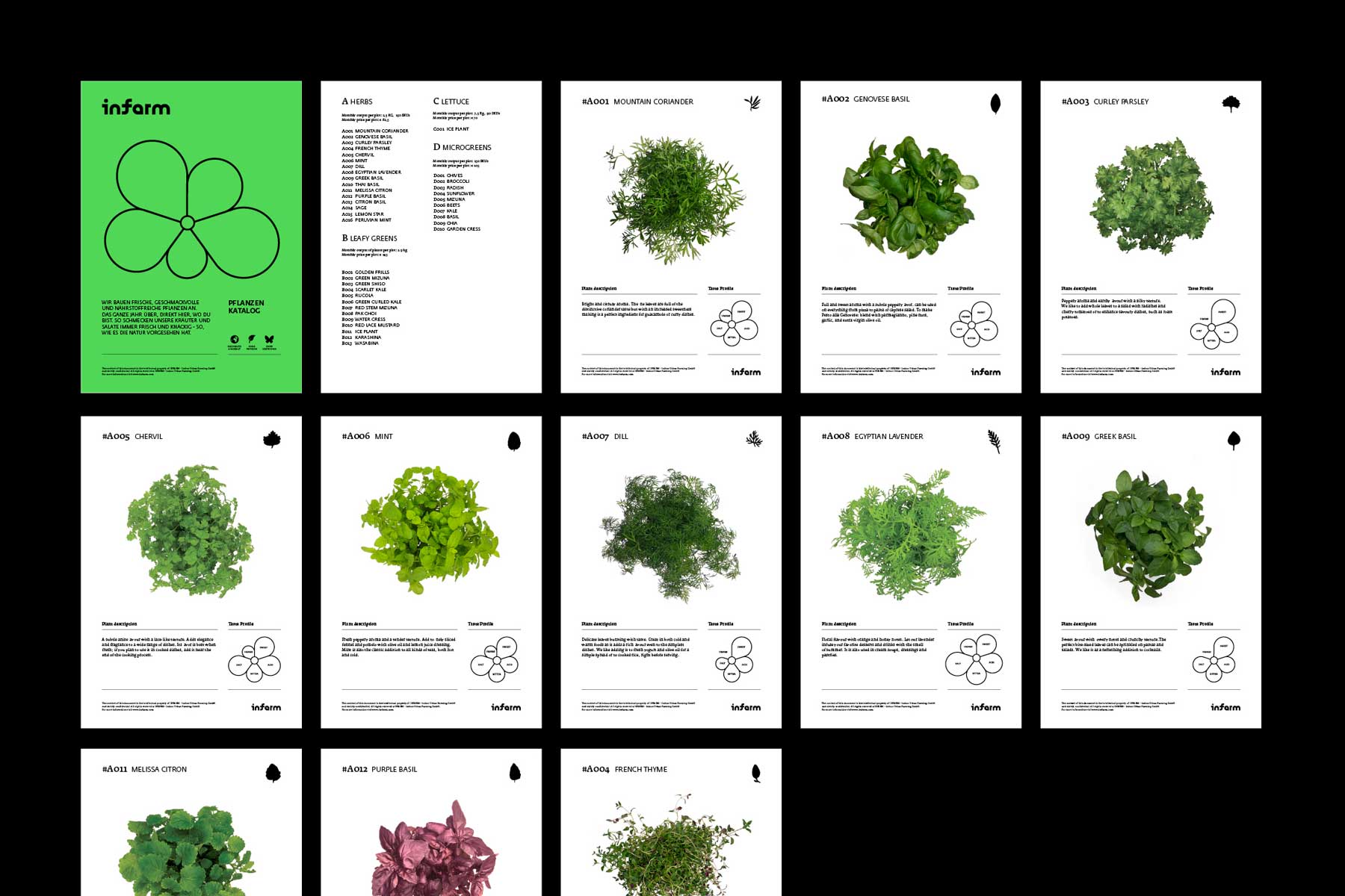
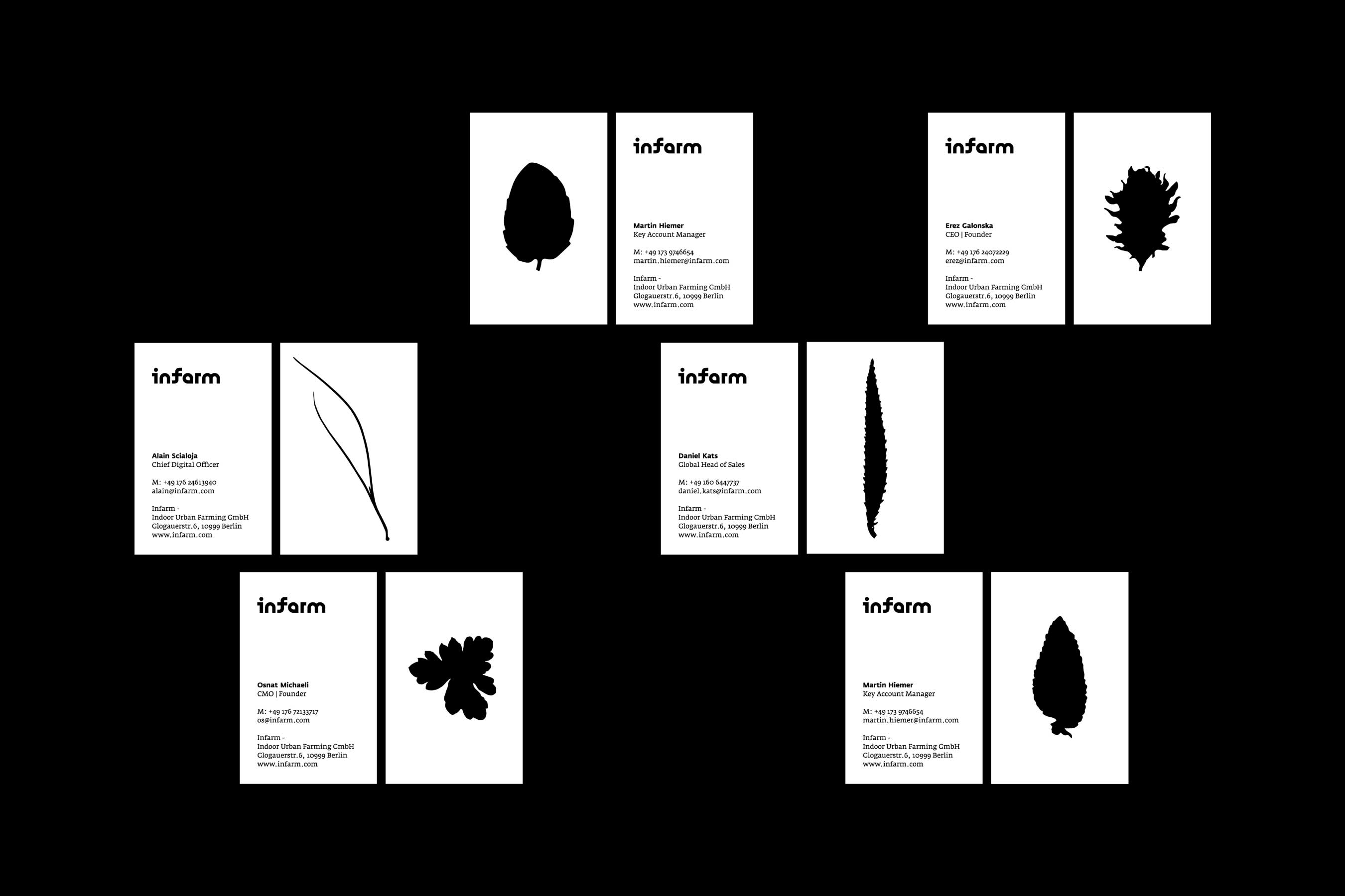
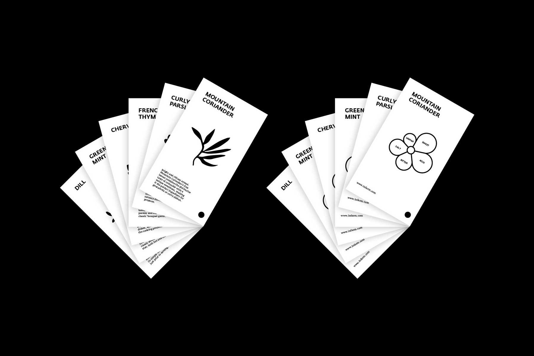
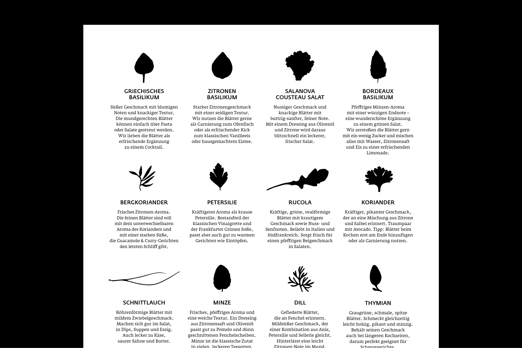
The design relies on a minimalist usage of black and white and an assembly of sans serif and serif typography. The archetype leaf of each plan is flattened into a graphic black icon. Together they create a typological series of shapes and serve as DNA for the wide spectrum of plans. When an info text is added they serve as an index.
🍒 Collaboration with Gila Kaplan